Author
Former teacher of Maths, Chemistry and Computer Science in Hungary, former college professor in Hungary, Learning Technologist in Scotland.

Former teacher of Maths, Chemistry and Computer Science in Hungary, former college professor in Hungary, Learning Technologist in Scotland.
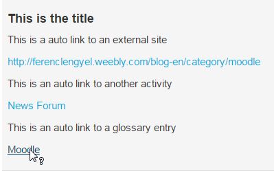
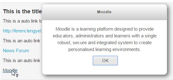
 Filters can be used to create links automatically in your course content, which is a really great functionality, but too many links can distract the student or they can be annoying or confusing. In the following example, I did't really create the links in the text editor, just let the system does its job. 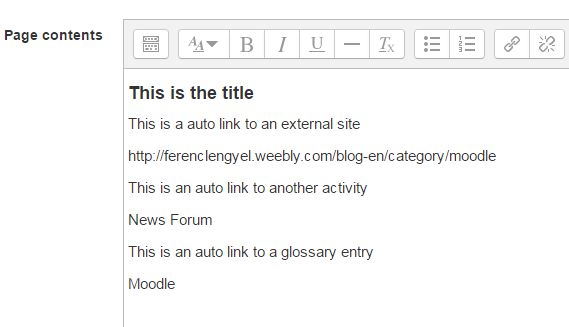 And this is how it looks when you save it: 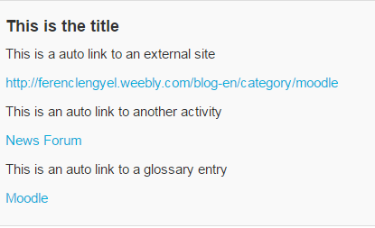 The external link (my blog) was created automatically because of the following setting: https://docs.moodle.org/32/en/Convert_URLs_into_links_filter The activity (News Forum) link was created because of this setting: https://docs.moodle.org/32/en/Activity_names_auto-linking_filter The glossary auto link (Moodle) was created by https://docs.moodle.org/32/en/Glossary_auto-linking_filter But they all look exactly the same, so the students don't know if the link takes them to somewhere else (first two) or just give them a brief explanation (third one).
Let's change the style to make the glossary link different. Go to your theme settings and add the following code to the Custom CSS section: CSS
The link colour is the same as the text colour, underlined (the default links are not) and the gap between the letters is a little bit bigger. Something like this: 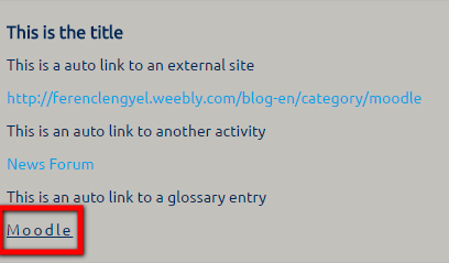 Now the students still can see the glossary entries, but they are not as disturbing as they used to be. If the learning material is full of glossary links, the text is still readable and the links don't distract the readers. The difference between a link to another page and a glossary popup is more obvious. 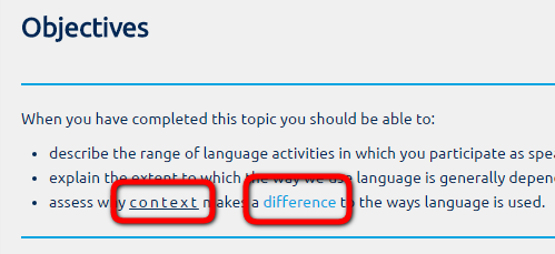 Enjoy.
More tricks coming soon...
0 Comments
Leave a Reply. |
 RSS Feed
